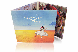
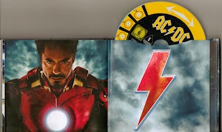
I have been looking at digipak's of the indie genre of which are band song choice is. One of the examples of this is a band called The Script. This is an indie rock band and this is their digipak. They have a running theme throughout of hands being together and colour theme. The colours are beige and and browns with the black being their jackets and hair. This makes them stand out more so the band is highlighted on their digipak.This is something you really see in an indie band digipak, having a running theme on it so that people recognise the band and this certain album by the hands and the beige and brown colours.
Of Monsters And Men is an indie band that have created a digipak that is made out of the card that they are normally made out of. It has only one fold that has been made with the CD and a booklet within that included their lyrics. This is a basic digipak which goes with the bands theme as they are very pastel with their colours and natural with the pictures and colours that they use. This digipak follows the basic codes and conventions of a digipak, with the songs in a list on the back of the CD album and the CD being in one side of it. It has acknowledgements on the inside on the right. This is something we are going to do with our song and band digipak.
The Kooks again, have a running colour theme throughout their digipak. The theme is black and white and the red is the main colour that stands out and makes the CD album stand out from other black and white CD's in the stores that it is being sold in. They have also followed the normal codes and conventions of a typical digipak by having the list of songs on the back of the album. They have gone different from other indie bands digipak's because they have an image of themselves as they don't normally do this because indie bands aren't as they aren't as popular as other bands/artists.
Monday, 16 December 2013
Digipak's
 A digipak is a special CD album that is a folded book-style album. Sometimes the album has a CD and a DVD within the digipak that has many folding panels. Some have a minimum of one, up to four folds that contain elements of the digipak of the band/artist of the album.
They are normally made of card instead of the normal plastic CD album cases.

Digipaks used to be very are whereas now they are very popular and used by many bands and artists.
Font style idea
This font is called Lithos and we like it as it is very plain and in capital letters which is what we are aiming for as the video will then stand out more against the font of the title before the video begins. This font is different to an average style capital font style so it goes with the indie band and how the a different to others with their songs and their CD covers.
This font is called Orator. This is another font idea that we had in mind for the beginning of our music video for 'Alone In This' as it is again, a very basic font but is very effective as it looks very serious and the type writer styles shows that it is like a document by someone which goes with the way we are shooting our music video as we are doing many shots like a handheld camera from our main characters point of view so it is her documentation which links in with the font style perfectly.
This font style is called Nueva which is a very small basic, capital styled font for our title. This is a cool font style for us to use because it is very basic but has a unique twist on it which is what we are showing our main character as, a basic family living in poor conditions, but a unique twist of hope.
Subscribe to:
Comments (Atom)


